# Forms
# Forms
Forms is a feature that allows users to manage their forms, including creating, editing, and deleting them. Forms are based on a pre-defined form configuration.
# Forms Dashboard
Loading the image...
To access Forms Dashboard, simply navigate to the Forms section in the navigation menu of the application.
# Search
The search bar in Forms Dashboard allows you to search for forms by entering relevant keywords in the search field.
# Create Form
Loading the image...
To create a new form, click on the "Create Form" button, which will prompt you to enter a description and the form configuration relation. Once entered, you can proceed to the form builder to fine-tune and preview your form.
# Description
The description is the unique name of the form, provided during its creation. It can be edited if necessary to reflect the utility of the form.
# Form Configuration
The Form Configuration column displays the form configuration that the form is connected to. The connected form configuration allows the mapping of form fields to a specific connector. If necessary, the connected form configuration can be changed in the edit view.
# Actions
Loading the image...
The three-dot action button for each form provides additional utility actions per form. You can easily edit, duplicate, and delete the form via the dropdown.
# Edit Form
To edit a form, click on "Edit" in the three-dot action dropdown for the form you want to modify.
# Form Builder
Loading the image...
The Form Builder enables you to customize the form needed for your campaign. On the left side, you can select and add layout components to enhance your form. You can choose from elements such as Submit buttons, tables, HTML elements and more. You can drag and drop new Layout Components in the form to change the general layout.
# Form Component Actions
Loading the image...
For the the form, you can find the form fields inherited from the form configuration. Each form has actions visible on hover.
- Edit: Shows a powerful component editor based on Formio (opens new window)
- Move: Holding and dragging the move button lets you rearrange form elements
- Edit JSON: Enables edit of the JSON object of the specific form element
- Copy: Makes a copy of the selected form element in memory
- Paste below: (Only visible when form element is copied)
- Delete: Removes the form element from the form
# General
Loading the image...
In the General section, you can edit the description or change the form configuration relation of the form.
# Translations
By configuring translations you enable the form to be used within a multi-language page. The key of the translations should be the label in the form field.
As example, you've defined all the labels in the form to be English. So we're taking First Name as example
e.g.
| label | language | key | value |
|---|---|---|---|
| First name | en-UK | First name | First Name |
| First name | nl | First name | Voornaam |
| First name | de | First name | Vorname |
TIP
You should also take into account the error messages. They can be configured as the following:
| language | key | value |
|---|---|---|
| en-UK | error | Please fix the following errors before submitting. |
| en-UK | invalid_date | {{field}} is not a valid date. |
| en-UK | invalid_email | {{field}} must be a valid email. |
| en-UK | invalid_regex | {{field}} does not match the pattern {{regex}}. |
| en-UK | mask | {{field}} does not match the mask. |
| en-UK | max | {{field}} cannot be greater than {{max}}. |
| en-UK | maxLength | {{field}} must be shorter than {{length}} characters. |
| en-UK | min | {{field}} cannot be less than {{min}}. |
| en-UK | minLength | {{field}} must nog be longer than {{length}} characters. |
| en-UK | next | Next |
| en-UK | pattern | {{field}} does not match the pattern {{pattern}}. |
| en-UK | previous | Previous |
| en-UK | required | {{field}} is required. |
| de | required | {{field}} is erforderlich. |
| ... | ... | ... |
Loading the image...
# Revisions
Loading the image...
The Revisions tool allows you to monitor editorial changes made to the form by workspace users. This will enable you to easily detect mistakes using the timeline and the visual edits of the form.
The timeline shows the activity history of all the users. The top revision shows your latest/current edit, and the revisions below show earlier versions. By clicking on each activity, you can see the changes in the preview tab on the right.
# Dynamic Payment Methods
To begin using Dynamic Payment Methods on Novti, you should map the shared field labelled as Dynamic Payment Methods with the name [dynamicpaymentmethods][paymentmethod].
If you need comprehensive guidance on how to map fields, it is highly recommended that you consult the Form Configurations documentation. This resource provides an in-depth look into the process, giving you step-by-step instructions to ensure you can effectively navigate the mapping fields operation.
Mapping this field will enable the configuration of payment methods within the Form Builder.
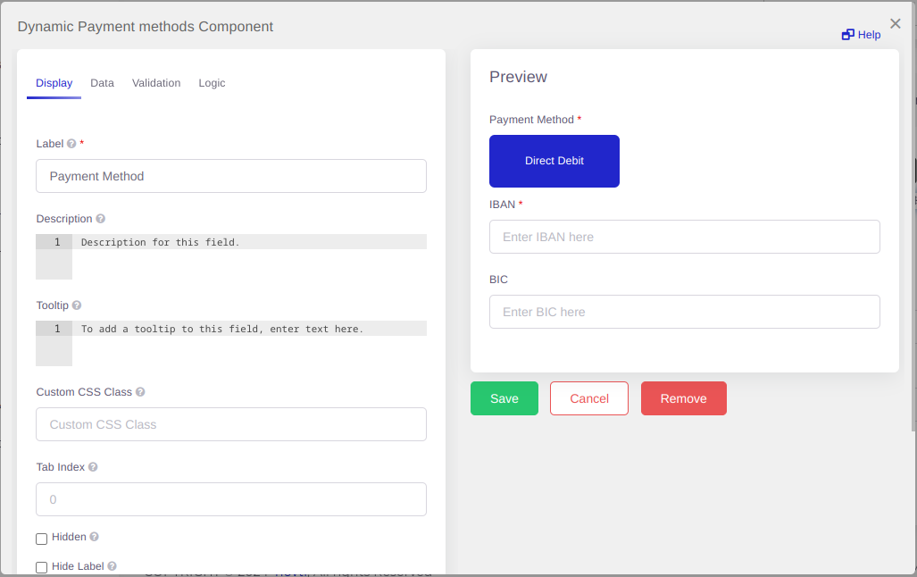
# Configuration
When you're setting up your dynamic payment methods, there are two essential sections you need to focus on within this component. The first is the Data section, which is where you'll input all the relevant information regarding your various payment methods. The second crucial part is the Validation settings. This is where you'll set the rules to ensure that the data entered is correct and valid, which is a critical step for the smooth operation of your form.
Your payment methods settings include the default frequency and amounts setting, as well as a list of available payment methods. This list comprises the payment methods currently supported and enabled by Novti. We're constantly working on expending our list. Feel free to contact us if your desired payment method is missing in the supported list.
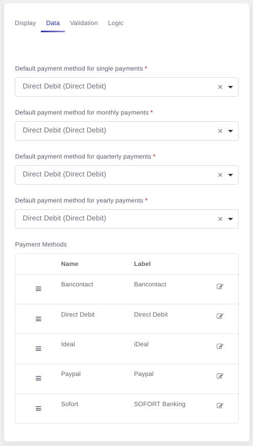
Each payment method has these fields enabled by default:
- Name: data representation of the payment method and will be used inside the transaction.
- Label: visual representation of the payment method and will be shown to the end user.
- Settings: all the dynamically set fields of the payment method and differs for each one. The possible fields are:
- Image: URL pointing to an icon you want to use to enhance your form visually.
- Frequencies: controls if your payment method is only enabled on a certain frequency and works in conjunction with the
Frequency & Amountscomponent. - Description: provide the end user with more information about the payment method.
- Fields: configure text fields to request additional information for the payment method, such as asking the user for a banking number.
- Options: add options to a select or radio input depending on the payment method.
# Transactions
Documentation is on the way....